Design and development of font "TeenRay"
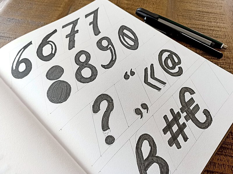
Challenge
I wanted to elevate my print and web projects to a new level of design within the realm of editorial web design, and I also needed to devote more attention to my creative side—seeking new perspectives and forms of expression. To achieve this, I wanted to work with expressive, distinctive typography that deliberately eschewed the conventions of perfect legibility and accessibility; the logical next step was to develop a typeface of my own.
The focus was on a relaxed, intuitive approach to the individual glyphs. Rather than functioning as a neutral utility, the typeface was intended to serve as a characterful display font that establishes its own visual language and invites the viewer to engage with the letterforms. It was deliberately not designed for use in long-form body text.
Research & Concept
As a basis for my design work, I analyzed experimental print products and editorial designs from the 1990s. I was particularly interested in the question of how typography conveys a message and creates a strong visual impact.
Starting with two grunge typefaces, I developed initial sketches and combined their design approaches to create my own visual language. Through numerous iterations, an increasingly clear picture emerged of the design possibilities and the typeface’s intended use.
Font development
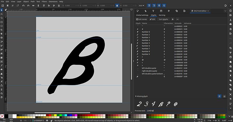
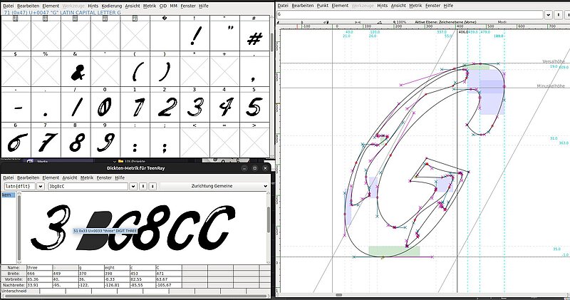
Since the typeface consists almost exclusively of uppercase letters and each glyph has its own unique character, I was able to deliberately deviate from the traditional development process. Instead of first defining the basic shapes of the lowercase letters, I developed the letters freely and independently of one another.
The hand-drawn sketches were scanned, vectorized in Inkscape, and optimized in terms of shape and number of nodes. I then imported the glyphs into FontForge, where the actual typeface was created.
There, all glyphs were technically refined, hinting was applied, they were tested using various word lists, and they were visually harmonized through kerning pairs. Especially with an experimental display typeface, this fine-tuning is crucial for a harmonious typeface appearance.
Test & Validation
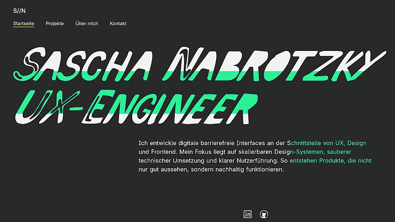
Finally, I exported the typeface both as an OTF file for desktop publishing applications and in WOFF2 format for use on the web. In numerous practical tests, I checked letter spacing, kerning, and the effect of various word combinations.
Since the typeface is intentionally experimental and unconventional, mathematical perfection was not the goal. Rather, the aim was to preserve its typographic originality and maintain the typeface’s lively, raw character even in the final version.