Childminders perceived more professionally
Challenge
Childminders were often not perceived as professional service providers within the community and had little influence in local decision-making. To strengthen their position, they formed an association and needed a website that would underline their professionalism and build trust with their target audiences. The goal was to create a consistent and serious design across all touchpoints — deliberately avoiding playful or overly childlike visuals.
User Research
- What questions must the website answer?
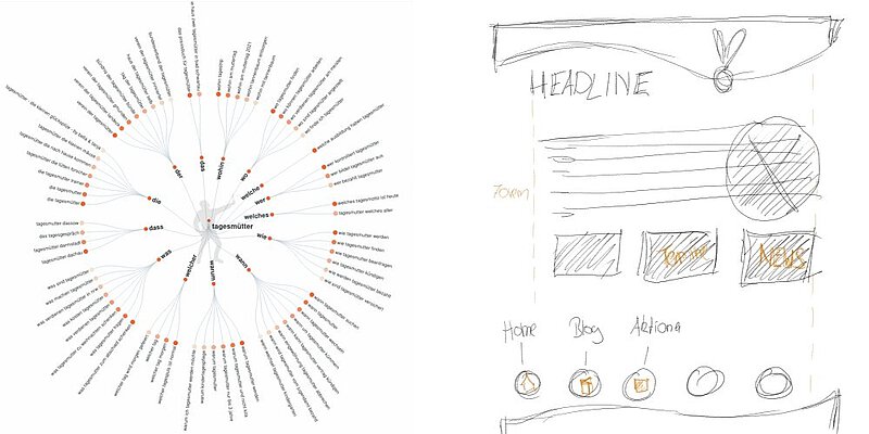
AI-supported research identified the most common user questions: Who are the childminders? What qualifications do they have? How can I get in touch? What childcare places are available? - What expectations do users have of childminders?
Existing user research and studies on similar projects were evaluated to understand expectations around professionalism, transparency, and reliability. - Which content is most important to the target audience?
Parents prioritize clear information about educational concepts, qualifications, and booking procedures; municipalities are mainly interested in legal frameworks and partnership opportunities. - What tone and design are perceived as professional?
Analysis showed that a clear, calm, and serious visual style builds trust — colorful or playful designs were seen as counterproductive for the intended perception.
Concept and Implementation
Content & Structure:
- Development of a clear content architecture based on user needs: Homepage, About Us, Services, Information for Parents, Contact Form.
- Prioritization of transparency and intuitive navigation.
Design & Development:
- Creation of a consistent visual system, featuring a restrained color palette aligned with the childminders' preferences.
- Logo design and derivation of the visual identity.
- Sketching of minimalist wireframes to visualize early-stage navigation and user flow.
- Responsive front-end development with a strong focus on performance and SEO optimization.
Optimization:
- Elimination of non-essential design elements to emphasize professionalism.
- Ongoing refinement of content according to UX writing best practices (clear, concise, and trust-building communication).
Accessibility:
- Test and validate all pages with browser tools for accessibility, such as Wave or developer tools, and by keyboard.
Testing and Validation
- Heuristic evaluation to detect and correct usability issues early on.
- Application of the 5-second test on the homepage to ensure the core message and call-to-action were immediately clear.
- Iterative adjustments based on test results, especially in terms of text conciseness and visual focus.
- Test and validate all pages for accessibility with browser tools, such as Wave or developer tools, and by keyboard.
Result
The website for the childminder association was successfully launched and became a well-regarded addition to the association’s foundation efforts. It is positively received by both parents and local authorities, offers comprehensive information, and effectively supports the development of a professional and competent public image for the newly founded organization.
Conclusion
- The development of the website has clearly shown how decisive creative restraint and clarity of content can be for a professional public image - especially in sensitive areas such as childcare. The deliberate rejection of playful elements in favor of a serious, confidence-building design was positively received by all target groups.
- Accessibility proved to be essential - regardless of legal requirements - in order to provide all users with equal access to the website. Organizations with a social mission in particular should set a good example here.
- Another key learning point was that design concepts take time: Only by consciously pausing and re-examining do viable solutions emerge that are coherent and effective in the long term.
Illustrations
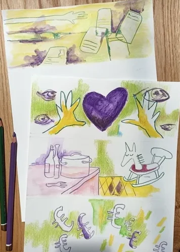
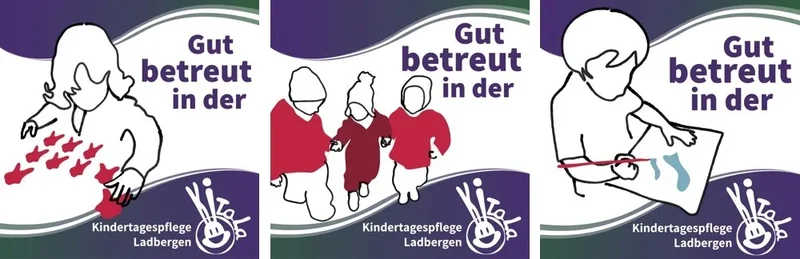
Illustrations for Faq section Mixed Media
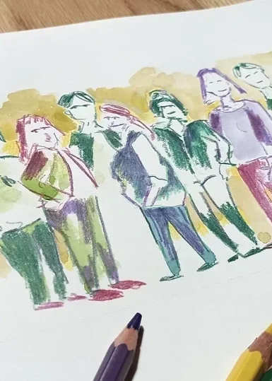
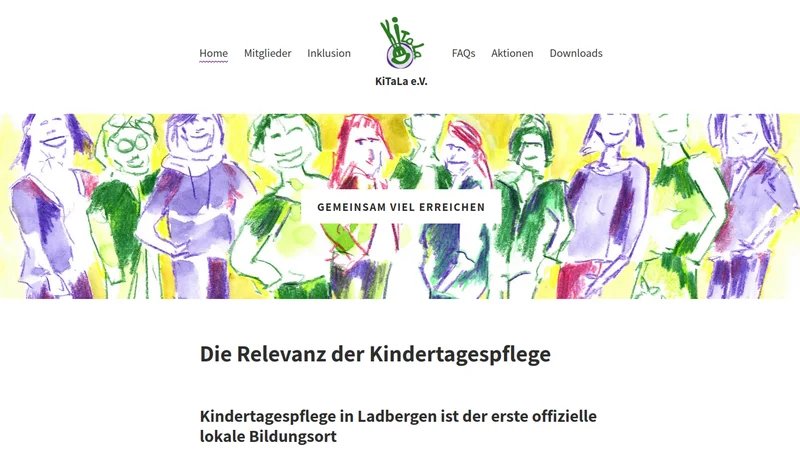
Header Illustration: Loose and sketchy with colored pencils
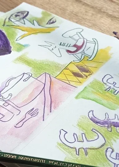
Illustrations for Faq section Loose and sketchy, mixed media