28% increase in sales in the online store


Challenge
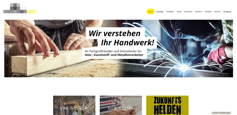
The existing online shop was outdated and poorly structured in many areas, negatively impacting the user experience and competitiveness. The goal was to modernize the shop based on the existing framework, relieve customer service agents and sales representatives through simplified communication channels, and improve the user journey so that customers could complete purchases more quickly and order more frequently.
User Research
Methods:
- Qualitative interviews with customer service agents, sales representatives, and end customers
- Quantitative analysis of Google Analytics data
Findings:
- High bounce rates on certain pages indicated issues with user guidance.
- Missing product images significantly hindered the ordering process.
- Complicated registration and communication processes led to customer insecurity.
- Negative aesthetic perception: The design was seen as outdated and inconsistent, reducing user trust.
Key Questions:
- Where exactly are users dropping off?
- What information is missing during the ordering process?
- How do users emotionally experience interacting with the shop?
- What barriers are there to easily contacting the company?
Concept and Implementation
Content & Structure:
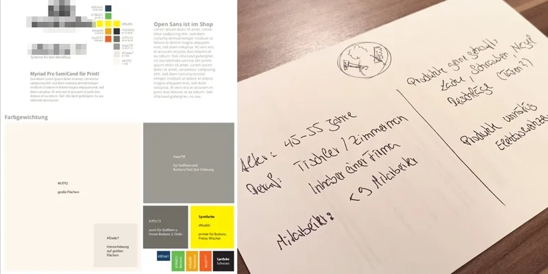
- Creation of a proto-persona to align the team around key user needs.
- Development of landing pages specifically tailored to user needs and promoting integration with the planning software.
Design & Development:
- Expanded the color palette harmoniously without changing the primary brand colors, creating more emotional touchpoints.
- Tested new font pairings and developed a consistent corporate identity to convey professionalism and modernity.
- Implemented a chat module to resolve customer questions and problems in real time and lower the barrier for contacting the company.
- Integrated a newsletter module as a cost-effective replacement for flyers, improving customer communication about new products.
- Optimized product presentation by enhancing 65,000 product images and descriptions using Photoshop automation.
Optimization:
- Continuous usability reviews based on established heuristics.
- Regular iteration and adjustments based on user feedback and web analytics insights.
Testing and Validation
- Applied heuristic markup to identify usability issues early.
- Conducted 5-second tests after each design iteration to validate first impressions.
- Monthly tracking of revenue growth as a KPI to measure the success of implemented measures.
Result
- 28% revenue increase through improved product presentation, consistent and modern design, and enhanced customer communication.
- Significant increase in user satisfaction, evidenced by longer time on site and higher conversion rates.
- Increased efficiency for customer service agents and sales representatives through optimized processes and new communication channels.